This post will guide you how to add the dotted line for the forecasted data in an existing line chart in excel.
Assuming that you have a line chart that shows the actual data, and you can also add the forecast values as another data series, and how to add those newly forecast values into the existing line chart as a dotted line.
1. Add Dotted Line for Future Data
To add the dotted line for the forecasted data in one excel chart, just do the following steps:
#1 insert one column and add the forested data into this column.
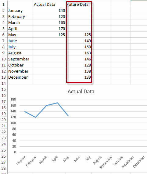
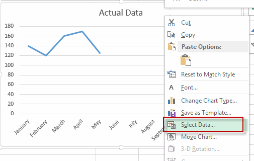
#2 select the current line chart, right click on it, and select Select Data… from the pop-up menu list. The Select Data Source dialog will appear.
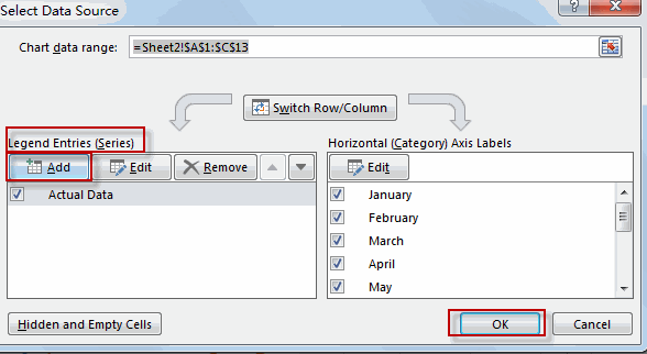
#3 click Add button under Legend Entries section. The Edit Series dialog will appear.
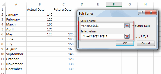
#4 type one series name in the Series name text box, then select the data in the future data column. Click OK.
#5 you will see that the line of the future data is added in the existing chart.
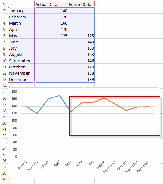
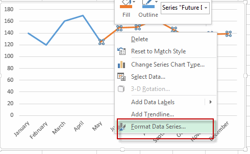
#6 select the newly added line, right click on it, and select Format Data Series… menu from the pop up menu list. The Format Data Series pane is shown in the right of window.
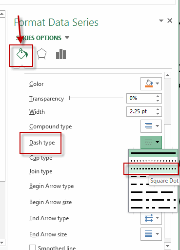
#7 click Fill&Line, select Square Dot from the Dash type drop-down list.
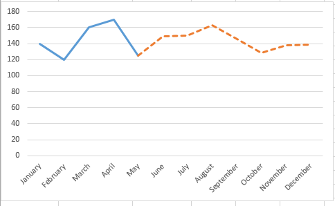
#8 let’s see the result.
2. Video: Add Dotted Line for Future Data
In this video tutorial, we’ll uncover a powerful technique for enhancing your line charts in Excel. We’re going to explore how to add a dotted line to represent forecasted or projected data, making your charts more informative and visually appealing in Excel.
Leave a Reply
You must be logged in to post a comment.